ShopDreamUp AI ArtDreamUp
Deviation Actions

Name: Mario Sanchez aka Aegis-Illustration
Tools of the Trade: Adobe Photoshop CS2, Corel Painter IX, Apophysis 2.02, Terragen, Photomatrix Pro, Genius Tablet 8x6
Likes to use: Classic nude poses (specially from lockstock and justmeina ), still life objects, mixed media (photomanipulation + painting + 3D + vector)
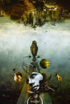
Examples of his work:

Aegis-Illustration’s tips and tricks:
1.- Textures:
Many people have asked me how I use textures. It’s pretty simple. Instead of taking some texture images and merging them, what I do is putting one as a background. Then, I start taking the rest of textures I want to use, and low their opacity around 40-50% and sometimes using Soft Light. Then I start cloning them with dispersion options to make them look smooth. I erase zones I think that are rough and then I merge all texture layers and desaturate them. Later I tweak with colour using Colour balance, Hue and saturation, Levels, Curves and Photography filters. That’s what I do for backgrounds. Later I add a single texture to cover the entire image, usually in Soft Light with 40% opacity.
2.- Cutting images and integrating them:
Sometimes using the Pen Tool is not enough. When you put your cut image into the background sometimes it stands out so much. I have a little tip for this apart of adjusting colours and light, obviously. It is making an inner shadow in Layer Style with 0 distance points and low opacity. It helps a little specially in dark backgrounds. Another tip I have is to blur with the Blur tool the borders of the image to do not make them stand out so much.
3.- Colours:
It is important to create a harmonic colour palette. Be sure to tweak colours in all layers. I use Colour Balance and Hue & Saturation for that purpose and I adjust lights too with Levels. Doing this simple step you will integrate the colours of everything and your images will look more balanced!
4.- The importance of a background:
Sometimes our images look chaotic because they have so many elements on them. It is important to keep a clean and clear background. You can add as much elements as you wish, of course, but avoid making a background with lots of elements or details because that will distract the eye from the main subject. You can always create a textures background but desaturate its colours to make it look in 2nd plane, or just blur it a little. Just keep in mind that the background is not the protagonist of your images (usually).
5.- Cleaning stock:
I could write a thousand lines about this but there are two simple steps to clean a stock image. The first one is with Filter>Noise>Noise reduction. Tweak with the parameters but be sure your image doesn’t end looking out of focus. This is a better way of using Gaussian Blur because that makes disappear important lines and the contour.
If you want to make your stock model photo look really good, there is a harder process, using the Smudge tool. Be sure to smudge only big parts and not contours or important lines like eyes, mouth, fingers, etc.
6.- Blur and Focus:
Like in a real photograph a photomanipulation could use blurring of the less important parts, as the horizon or some parts of the image to lead the eye to the main subject, which sometimes could use some focus on it. You don’t really have to know anything about photography, but for example, when viewing with your eyes, you will see some thing more contrasted and other more blurred. Maybe your main subject is in the 2nd plane, so then try to blur the 1st one, and vice versa. Play with that, it’s more important than you think!
7.- Lighting:
Lighting is something very important if you want to integrate all elements within a scene. Most of the times the different photos you are going to use will have different points of light. You should leave the lighting for the end process. When you have all elements, you have to decide where the light is coming from. If, for example, your lighting comes from the upper right corner, be sure to use the Dodge tool to lighten the parts at the right and the Burn tool for the left zones. Keep in mind that if an arm is in the left zone where is the source of light, although its left part will be lightened, its right part will still be dark. If the difference between darkness and light between your images is very strong, apply Image>Adjustments>Brightness/Contrast. Then you’ll be able to apply lights and shadows more easily.
8.- Composition:
Composition is not something only photomanipulation related. It is something you must keep in mind while creating anything. Before I start a piece, I always visualize where every element is going to be placed. Keep in mind that you need a main subject which is called “focus”. Your focus should attract the attention of the eye. You can give it a different tonal range, desaturate the rest of elements or put it in some position in which it grabs your attention. Even chaotic pieces have a focus most of the times so don’t forget that. Try to know what you are going to do before acting. Randomly is funny but that doesn’t assure you a good result most of the times.
9.- Filters:
Filters are dangerous. Most of them are. If you are doing a photomanipulation you should keep in mind that filters are not your friends, most of the times. Personally I only use filters of Noise, Sharpen and Blur. The rest will give an amateur-feel to your pieces. Avoid especially the Artistic filters. This is not exactly a tip but a suggestion, but I think it’s something to keep in mind.
10.- Post-production:
This is one of the most important steps to follow and sadly it’s forgotten most of the times. When you have a finished image, merge all layers. Now you can start playing again with Colour Balance, Hue & Saturation, Curves, Levels, and the like. Your image will turn in something more harmonic. Maybe this sounds like nonsense but I can assure you this will give a more professional look to your pieces.
11.- The final touch:
When you think you have finished your image, there it is a little touch that will make it looks better. With all your layers merged, go to Filter>Sharpen>Unsharp Mask. Use a Radius no bigger than 0.3 and a size of a 250% more or less (depending on image size). See? Everything looks better now!
12.- And memory saving:
If you want to work comfortably in Photoshop before doing anything you should go to Edit> Preferences> Plugins and Scratch Disks. If you have more than a hard drive, in the first option put the one which has more free space. If you have only one hard drive as most of the people, you can always make a partition. Leave one for Photoshop only and leave it with a lot of free memory, then the program will go smoothly. Otherwise, while working with big images it could freeze! Keep in mind that if Photoshop is in the same place where most of your most used programs are, it will go slowly as well if you have a lot of programs running.
Aegis-Illustration’s 3 favourite tutorials:
The Ultimate Guide to Textures by textureific is a tutorial about composing textures and the like, how to merge them and make them look good.
Guide to Stock – Part 1 by AttempteStock is a great resource if you want to know how to take good pics for your photomanipulations. A must see!
Photomanipulation basics 101 by Cobweb-stock is an useful tutorial about cleaning images and adjusting stock model photos.
Please keep in mind that these tips and tricks are never meant as the only way to do something – they are the way the artist does things. They are meant to guide you or give you ideas what can be done and should be taken as such.
If you have any suggestions for deviants you’d like to see sharing their tips and tricks, feel free to write me a note. Just keep in mind that this article is mainly focused on photomanipulators.
Lastly, I would like to thank Aegis-Illustration for sharing his tips and tricks
and you for reading them
kuschelirmel
Tools of the Trade: Adobe Photoshop CS2, Corel Painter IX, Apophysis 2.02, Terragen, Photomatrix Pro, Genius Tablet 8x6
Likes to use: Classic nude poses (specially from lockstock and justmeina ), still life objects, mixed media (photomanipulation + painting + 3D + vector)
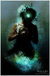
Examples of his work:
Aegis-Illustration’s tips and tricks:
1.- Textures:
Many people have asked me how I use textures. It’s pretty simple. Instead of taking some texture images and merging them, what I do is putting one as a background. Then, I start taking the rest of textures I want to use, and low their opacity around 40-50% and sometimes using Soft Light. Then I start cloning them with dispersion options to make them look smooth. I erase zones I think that are rough and then I merge all texture layers and desaturate them. Later I tweak with colour using Colour balance, Hue and saturation, Levels, Curves and Photography filters. That’s what I do for backgrounds. Later I add a single texture to cover the entire image, usually in Soft Light with 40% opacity.
2.- Cutting images and integrating them:
Sometimes using the Pen Tool is not enough. When you put your cut image into the background sometimes it stands out so much. I have a little tip for this apart of adjusting colours and light, obviously. It is making an inner shadow in Layer Style with 0 distance points and low opacity. It helps a little specially in dark backgrounds. Another tip I have is to blur with the Blur tool the borders of the image to do not make them stand out so much.
3.- Colours:
It is important to create a harmonic colour palette. Be sure to tweak colours in all layers. I use Colour Balance and Hue & Saturation for that purpose and I adjust lights too with Levels. Doing this simple step you will integrate the colours of everything and your images will look more balanced!
4.- The importance of a background:
Sometimes our images look chaotic because they have so many elements on them. It is important to keep a clean and clear background. You can add as much elements as you wish, of course, but avoid making a background with lots of elements or details because that will distract the eye from the main subject. You can always create a textures background but desaturate its colours to make it look in 2nd plane, or just blur it a little. Just keep in mind that the background is not the protagonist of your images (usually).
5.- Cleaning stock:
I could write a thousand lines about this but there are two simple steps to clean a stock image. The first one is with Filter>Noise>Noise reduction. Tweak with the parameters but be sure your image doesn’t end looking out of focus. This is a better way of using Gaussian Blur because that makes disappear important lines and the contour.
If you want to make your stock model photo look really good, there is a harder process, using the Smudge tool. Be sure to smudge only big parts and not contours or important lines like eyes, mouth, fingers, etc.
6.- Blur and Focus:
Like in a real photograph a photomanipulation could use blurring of the less important parts, as the horizon or some parts of the image to lead the eye to the main subject, which sometimes could use some focus on it. You don’t really have to know anything about photography, but for example, when viewing with your eyes, you will see some thing more contrasted and other more blurred. Maybe your main subject is in the 2nd plane, so then try to blur the 1st one, and vice versa. Play with that, it’s more important than you think!
7.- Lighting:
Lighting is something very important if you want to integrate all elements within a scene. Most of the times the different photos you are going to use will have different points of light. You should leave the lighting for the end process. When you have all elements, you have to decide where the light is coming from. If, for example, your lighting comes from the upper right corner, be sure to use the Dodge tool to lighten the parts at the right and the Burn tool for the left zones. Keep in mind that if an arm is in the left zone where is the source of light, although its left part will be lightened, its right part will still be dark. If the difference between darkness and light between your images is very strong, apply Image>Adjustments>Brightness/Contrast. Then you’ll be able to apply lights and shadows more easily.
8.- Composition:
Composition is not something only photomanipulation related. It is something you must keep in mind while creating anything. Before I start a piece, I always visualize where every element is going to be placed. Keep in mind that you need a main subject which is called “focus”. Your focus should attract the attention of the eye. You can give it a different tonal range, desaturate the rest of elements or put it in some position in which it grabs your attention. Even chaotic pieces have a focus most of the times so don’t forget that. Try to know what you are going to do before acting. Randomly is funny but that doesn’t assure you a good result most of the times.
9.- Filters:
Filters are dangerous. Most of them are. If you are doing a photomanipulation you should keep in mind that filters are not your friends, most of the times. Personally I only use filters of Noise, Sharpen and Blur. The rest will give an amateur-feel to your pieces. Avoid especially the Artistic filters. This is not exactly a tip but a suggestion, but I think it’s something to keep in mind.
10.- Post-production:
This is one of the most important steps to follow and sadly it’s forgotten most of the times. When you have a finished image, merge all layers. Now you can start playing again with Colour Balance, Hue & Saturation, Curves, Levels, and the like. Your image will turn in something more harmonic. Maybe this sounds like nonsense but I can assure you this will give a more professional look to your pieces.
11.- The final touch:
When you think you have finished your image, there it is a little touch that will make it looks better. With all your layers merged, go to Filter>Sharpen>Unsharp Mask. Use a Radius no bigger than 0.3 and a size of a 250% more or less (depending on image size). See? Everything looks better now!
12.- And memory saving:
If you want to work comfortably in Photoshop before doing anything you should go to Edit> Preferences> Plugins and Scratch Disks. If you have more than a hard drive, in the first option put the one which has more free space. If you have only one hard drive as most of the people, you can always make a partition. Leave one for Photoshop only and leave it with a lot of free memory, then the program will go smoothly. Otherwise, while working with big images it could freeze! Keep in mind that if Photoshop is in the same place where most of your most used programs are, it will go slowly as well if you have a lot of programs running.
Aegis-Illustration’s 3 favourite tutorials:
The Ultimate Guide to Textures by textureific is a tutorial about composing textures and the like, how to merge them and make them look good.
Guide to Stock – Part 1 by AttempteStock is a great resource if you want to know how to take good pics for your photomanipulations. A must see!
Photomanipulation basics 101 by Cobweb-stock is an useful tutorial about cleaning images and adjusting stock model photos.
Please keep in mind that these tips and tricks are never meant as the only way to do something – they are the way the artist does things. They are meant to guide you or give you ideas what can be done and should be taken as such.
If you have any suggestions for deviants you’d like to see sharing their tips and tricks, feel free to write me a note. Just keep in mind that this article is mainly focused on photomanipulators.
Lastly, I would like to thank Aegis-Illustration for sharing his tips and tricks
and you for reading them
kuschelirmel
Artist Scam - there's a new one around!
[You can also read this article on my blog where it was first published] There are a million and one ways to get scammed on the internet, we all know that. And of course there are also scams directed at artists specifically (1). But there is a new scam in town that I want to talk about that is geared specifically towards online artists. If you are an artist with an online presence chances are you have received one private message or other on one of your social sites. These messages differ, depending what they are trying to sell you, but they usually have one thing in common: they sound like YOU are going to be the one earning a shit ton of money – for next to no effort. And usually that is because your art is just so special. aha. sure *sigh* (hint: no ones art could ever be that special) Note 1: I am not telling you any names because the next person trying to scam you might use a different one. Ultimately, the name is completely unimportant, what is important is to know that you
Notre Dame, Improvements and Progress
Progress is a strange thing. It can be so incremental that you don't realize you are making it :giggle: I've been looking through some old pictures I took these past 10 or so years since I've had a DSLR, particularly to see if there was something I would like to put up as exclusive stock for my upcoming contest (over at @kuschelirmel-stock - it'll start this weekend! :w00t: ). I stumbled upon our visits to Paris, where I found my Notre Dame pictures. I uploaded three here into my gallery (as well as making them available part of an exclusive stock pack - coming soon!): I still cannot fathom that a lot of it burned down in April 2019 (with no one getting seriously injured). It was one of my favorite places to visit in Paris; even with all the tourists inside, it felt super divine to be there. On a side note, despite large donations, the 2024 date set by French president Emmanuel Macron is seen as an impossible time frame, and especially so after the announcement in July 2020
Sneak Peak + Contest?
Well hello there! I am still here and seem to have some more energy lately - in big part thanks to my watchers and friends over at my stock account @kuschelirmel-stock who have managed to make me see that it is *not* just me who feels like all creativity has just drained from them these days. For some reason knowing I am not alone and that it is okay to voice these thoughts (despite that little voice in the back of my mind constantly shouting "Stop complaining, you've got it great, this is peanuts. Whimp!") has made a tremendous difference. :heart: :heart: :heart: Aaaand it also means I'm actively trying to be more active here on dA and "behind the scenes" with manips and uploading stock and I'm also keeping at it on the Photoshop 3D front! Not that I have managed to finish a manip yet, but hey, baby steps, right? :D Sneak Peak Here is a sneak peak at what I am currently working on (among other things - meaning it'll take ages to finish, but that is fine :D ): Can you guess
kuschelirmel - the art of Jasmin Junger
Since I don't get around to updating this journal as often as I should, I thought I'd leave you some information on me and what I do in case you're interested...
My name is Jasmin Junger, by day I work for an engineering and construction company based in Frankfurt am Main, Germany. I live in Karlsruhe though, that means quite the long commute every day (though I can do home office sometimes). That in turn means there is little time for my photography and photomanipulation hobby - so if you are trying to reach me, please don't get mad if I don't immediately respond.
I have been photoshopping for more than 15 years now and I still absolutely
© 2006 - 2024 kuschelirmel
Comments77
Join the community to add your comment. Already a deviant? Log In
Genial Mario! . Definitivamente es el dodecalogo que todo "Photoshopero" debe tener en mente