Know your Basics - Composition (the manip way)

15 min read

Deviation Actions

kuschelirmel's avatar
By
Published:
36.1K Views


The Rule of Thirds is another one of those expressions that you have probably heard before somewhere but aren't quite sure what it means. This article strives to shed some light on this rule as well as on how to use lines and shapes in your compositions to lead the viewer's eye to the important bits. There are some compositional rules and pointers that no artist should go without knowing!

The Technical Part

Rule of Thirds

Thankfully this time, there are no hours upon hours of dry reading to be done because the Rule of Thirds itself can be explained rather easily:
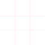
"The Rule of Thirds states that an image should be imagined as divided into nine equal parts by two equally-spaced horizontal lines and two equally-spaced vertical lines, and that important compositional elements should be placed along these lines or their intersections." (from the wikipedia article)


Or - summed up in one image:


Revelation 6:8 by kuschelirmel

The rider is set on the right vertical line while the horizon is on the bottom horizontal one.


Lines & Shapes

When talking about lines that lead the viewers eye within a composition, what is meant is best shown with an image:


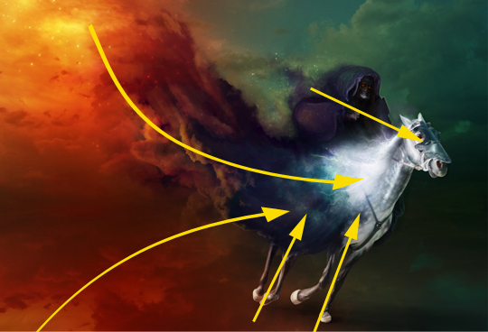
Revelation 6:8 by kuschelirmel

The arrows signify the lines that you could draw over the image using things that are already there: the most prominent is surely the line the clouds form and that will draw the viewer's eye right across the canvas and straight to the focal point.


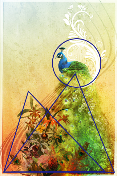
Something similar can be done with geometric shapes:


Just that the shapes can do a number of things: circles and elliptical shapes can form a "comfort zone" and thus give a point of interest encased in one a balance that may otherwise be hard to achieve. They can make something the center of attention without creating a fuss, just by having them in their actual center. On the other hand a circle can bring you to a stop because no line leaves it and all sides are equal... Other shapes, especially triangles and rectangles that stand on one point can be very dynamic. Triangles can point at something like the lines can, just with more "force" behind them. To see what I mean, take a look at the following signs and the association they cause in your brain just for being the shape they are:


The circle brings you to a stop, the triangles grab your attention and the stop sign is unique in its form so you're basically forced to look at it. On a side note: if you've read read Know your Basics - Colour Theory (the manip way) you should also notice something else, namely how the red colour gives the attention seekers another kick ;)


Beware of Absolutes

The Rule of Thirds is sometimes interpreted too strictly for my taste (as are the roles of the individual shapes you can find in an image). In my opinion, the more dynamic you want your image to be, the more you use one intersection to place your subject and the more different shapes you place around your image to keep the viewer's eye moving across the canvas. But if you're going for calmness, loss, despair or any other "not-so-dynamic" feeling, you need a different approach: less clutter and more centered compositions work better for that. It's as always: Think about what you want to convey and then think about how to achieve that - don't just use the Rule of Thirds like it was an actual Rule instead of a guideline. And sometimes your image may even benefit from breaking the rule completely...

Example Time!

Ex. 1 - The Shuttle by neverdying


Imagine the grid first: do you see how the astronaut and the axe are on opposite intersecting points? In the next step, notice the lines that are formed: the first, most prominent one is made up by the astronaut himself and the axe. Others can be seen in the architecture around the person, pointing directly at him (debris, blood, lamp, etc) and the gaping hole in his chest. That in turn is a circle and lets our eyes rest for a short time before we take in more of the surroundings, realizing that the safety hatch is (a circle) right next to the floating body and the curves of the shuttle suggest the cold calmness of being out there. This is the stuff horror movies are made of indeed!

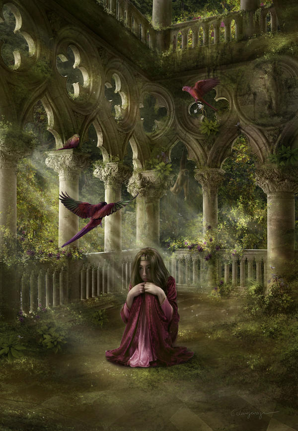
Ex. 2 - Lost by CassiopeiaArt


Here is an example of how not placing the main subject on an intersection, but "just" on one of the lines can make your whole image seem more peaceful. This feeling is enhanced by the stark, repetitive patterns of the architecture. Do you notice how every pillar can be seen as a line pointing back down to the girl? Even though your eyes will wander around the image, the whole composition (including the triangle of birds) always points back at her, unmoving and lost in the center.

Practice, Practice, Practice

While theoretic stuff such as the Rule of Thirds or the leading lines and shapes may sound abstract, if you try to see these patterns more consciously and apply them to your artwork, it can make your image pop that much more. But how do you learn how to do that? It's simple and complicated at the same time: you need to practice. Try to look at the following images and first ask yourself: What kind of mood/atmosphere/feeling do I get from this without thinking or reading the title? Then, go through the grid, the lines and the shapes and just pick out where they are before you finally try to put it together.

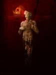
Delores... by WarpTheWorld :thumb256540126:
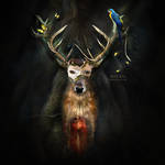
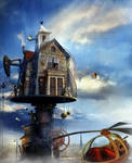
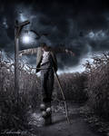
i wanna do bad things with you by miah-art :thumb258679092: The Fire Arrow by DanielPriego Deer king by gbindis Aerial Station 46: Westley by Eil My Heart Bleeds by fensterer Scarecrow by Taborda08 :thumb259660983:


I know it may feel slightly ridiculous to take a work of art apart in such technical terms - especially since the artist him/herself may not have been aware of using those rules/guidelines/compositional techniques. But that doesn't make them less useful. And I promise, the funny feeling will subside once you can see how the knowledge improves your work.

...and for the photomanip way?

As with everything, we manippers are in a kind of special position. While photographers use these techniques to figure out how to best frame their subject often without being able to influence its position much (think of a landscape shot or of architecture of example) and painters are free to choose their layout from scratch, photomanipulators are somewhere in between. But we can influence a lot by choosing stock and placing objects strategically as well as by cropping or enlarging our canvas.

Photoshop CS5 has the Rule of Thirds even built into the crop tool - but that is not the only way to get the grid. You can create your own grid in a new document so you can always drag it onto your canvas and then just use the transform tool to make it fit. Or you can use mine:


I hope this article was useful - if you liked it and haven't read the other one yet, it's called Know your Basics - Colour Theory (the manip way).

:heart:
Jasmin

PS: I didn't want to scribble all over someone else's art, so I used my own images as "scribbly examples".


All Articles

Know your Basics - Colour Theory (the manip way)Most of us have heard about Colour Theory - be it in school or on dA or as a term thrown about by someone somewhere. But what exactly is it? And how do you use it? This is what this article is striving to explain especially in regards to photomanipulation.
The Technical Part
Thankfully, there's tons of reading material about colour theory. Starting with the wikipedia article on the subject (which seems rather dry and boring to be honest) and ranging to tutorials written by deviants for their fellow artists. Those are the ones I'd like to recommend to you to get started in colour theory:

Still too dry and technical?
Okay, let me put it this way: the use of colours in your artwork can determine its mood and atmosphere. If you do it well, it can draw in the viewer and make them see what you want them to see by putting emphasis on certain parts. Colour theory gives you a way to know in
Know your Basics - Composition (the manip way)The Rule of Thirds is another one of those expressions that you have probably heard before somewhere but aren't quite sure what it means. This article strives to shed some light on this rule as well as on how to use lines and shapes in your compositions to lead the viewer's eye to the important bits. There are some compositional rules and pointers that no artist should go without knowing!
The Technical Part
Rule of Thirds
Thankfully this time, there are no hours upon hours of dry reading to be done because the Rule of Thirds itself can be explained rather easily:
"The Rule of Thirds states that an image should be imagined as divided into nine equal parts by two equally-spaced horizontal lines and two equally-spaced vertical lines, and that important compositional elements should be placed along these lines or their intersections." (from the wikipedia article)
Or - summed up in one image:
<a href="http://fav.me/d37v261">
Photomanips for BeginnersWhat is a photomanipulation?
Photomanipulations are images that have been composed of two or more photographic elements to create something new.
This is what the gallery description states. But what does it mean?
It means that a photomanipulation is based on photographs.
Not sketches scanned in (like line art for example) or screenshots from a video game. However, if you scan a photograph or for example dried flowers, it would be considered a photograph; while a photograph taken of line art still remains a sketch and is not consiered a photograph. Video game screenshots are copyrighted images btw and as such cannot be used at all.
It means that you need to use more than one photograph.
Retouching work as well as work that uses brushes or texture overlays only to "spice up" a photo that was taken by yourself(!) should be submitted to Photography > Darkroom, while work that uses stock images (i.e. images that you did not take yourself) should be


Journal Stock Credits: Kaotiksymphony-Stock and iMouritsa.
© 2011 - 2024 kuschelirmel
Comments58
Join the community to add your comment. Already a deviant? Log In
Nolamom3507's avatar
I have a set of composition brushes that I made for myself that anyone is welcome to Composition Brushes by Nolamom3507 by Nolamom3507